


My SciELO
 Custom services
Services on Demand
Journal
Article
 English (pdf)
 Article in xml format
 Article references
 Send this article by e-mail
Indicators
-
 Cited by SciELO
 -
 Access statistics
Related links
 Cited by Google
 -
 Similars in
SciELO
Similars in
SciELO  Similars in Google
Share

 Permalink
Gaceta Sanitaria
Print version ISSN 0213-9111
Gac Sanit vol.16 n.2 Barcelona Mar./Apr. 2002
Correspondence analysis of the Spanish National Health Survey
M. Greenacre
Department of Economics and Business. Centre for Research in Health Economics (CRES).
Universitat Pompeu Fabra. Barcelona.
Correspondencia: Michael Greenacre.
Universitat Pompeu Fabar. C/ Ramon Trias Fargas, 25-27. 08005 Barcelona
Correo electrónico: michael@upf.es
Recibido: 14 de junio de 2001.
Aceptado: 19 de octubre de 2001.
(El análisis de correspondencias en la explotación de la Encuesta Nacional de Salud)
Summary
This report gives a comprehensive explanation of the multivariate technique called correspondence analysis, applied in the context of a large survey of a nation's state of health, in this case the Spanish National Health Survey. It is first shown how correspondence analysis can be used to interpret a simple cross-tabulation by visualizing the table in the form of a map of points representing the rows and columns of the table. Combinations of variables can also be interpreted by coding the data in the appropriate way. The technique can also be used to deduce optimal scale values for the levels of a categorical variable, thus giving quantitative meaning to the categories. Multiple correspondence analysis can analyze several categorical variables simultaneously, and is analogous to factor analysis of continuous variables. Other uses of correspondence analysis are illustrated using different variables of the same Spanish database: for example, exploring patterns of missing data and visualizing trends across surveys from consecutive years.
Keywords: Correspondence analysis. Health survey. Principal component analysis. Statistical graphics.
Resumen
Este artículo desarrolla una amplia explicación de una técnica de análisis multivariada denominada análisis de correspondencias, aplicándola a datos de una encuesta nacional de salud, en este caso la Encuesta Nacional de Salud española (ENS). Primero se indica cómo puede utilizarse el análisis de correspondencias para interpretar una tabla de contingencia visualizándola en forma de un gráfico de puntos que representan las filas y columnas de la tabla. También pueden ser interpretadas diferentes combinaciones de las variables codificando los datos de la manera apropiada. Esta técnica puede emplearse también para obtener valores óptimos de escala para los niveles de una variable categórica, dándole de este modo un sentido cuantitativo a este tipo de variables. El análisis de correspondencias múltiple puede analizar varias variables categóricas simultáneamente, y es análogo al análisis de factores de las variables continuas. Otras aplicaciones del análisis de correspondencias se ilustran usando diferentes variables de la ENS; por ejemplo, para analizar pautas en los datos perdidos y visualizando tendencias entre encuestas de años consecutivos.
Palabras clave: Análisis de correspondencias. Encuesta de salud. Análisis de componentes principales. Gráficos estadísticos.
Introduction
The Spanish National Health Survey (Encuesta Nacional de Salud) is an example of a large complex social survey designed to establish a picture of the Spanish nation's state of health at a particular moment in time. We take the 1997 survey as an example, in order to show how correspondence analysis may be applied systematically to gain insight into the survey results.
In the 1997 survey there are some 46 basic questions, many of which can have multiple responses, effectively increasing the total number of questions to 83. Added to this there are several questions which are conditional on the responses to the basic questions, giving a maximum of 27 additional questions. Each of the 6,400 respondents interviewed thus provides between 83 and 110 items of information, so that the complete data file comprises approximately 640,000 numbers.
The usual way to summarize such data is to count frequencies of response and present these in tables or in graphical form, usually bar or line charts. A second level of analysis is to explore relationships between different questions in the survey. Standard procedures are available when the questions involve quantitative responses, for example correlation-based methods such as regression analysis, principal component analysis and factor analysis. In the case of categorical responses, which predominate in questionnaire surveys, the way to proceed is less obvious, for example relating health status, which is a multicategory variable having five possible responses, and the intake of medecines, where there are as many as 17 categories of medecine.
We aim to show how correspondence analysis can be used to explore relationships between variables in a complex health survey and suggest models for these relationships. Correspondence analysis is a method aimed specifically at quantifying categorical data, that is assigning numerical scale values to the response categories of discrete variables, with certain optimal properties. These scale values have been shown to have interesting geometric properties and provide what are called «maps» of the relationships between variables.
After introducing the method in «Correspondece analysis», we shall give a simple illustration in «Applications to crosstabulations» using a crosstabulation computed from the 1997 health survery. Further applications will be given using more complex crosstabulations. In «Correspondence analysis as a scaling method» we shall show how correspondence analysis can be used to develop scales which synthesize the responses to several questions which have a common theme. This is of great use in model building, since several categorical variables can be replaced by a single scale which can then be used in subsequent analyses such as regression analysis which require interval-scaled data. Several other issues will be dealt with, for example, the exploration of patterns of missing data («Exploring missing data») and how to explore trends between surveys from different years («Trend data»).
Correspondence analysis
The theory of correspondence analysis is fully explained in several texts1-6, including one in the context of biomedical research7. Here a non-technical introduction will be presented in the context of the health survey data.
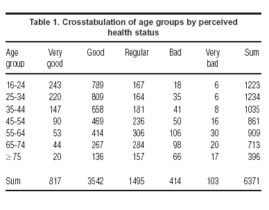
In its simplest form, correspondence analysis applies to a two-way crosstabulation, like the one in table 1. This table summarizes the distribution of perceived health status categories in different age groups. The ultimate aim of the method is to produce a «map» of this table, where each row and each column is represented by a point. This approach is very similar to that of principal component analysis, in that a measure of total variance of the table is defined and then this total is decomposed optimally along so-called «principal axes». For mapping purposes it is usually hoped that a large percentage of total variance is accounted for by the first two principal axes, thereby allowing the table to be visualized in two dimensions.
Correspondence analysis contains there basic concepts, that of a profile point in multidimensional space, a weight (or mass) assigned to each point and finally a distance function between the points, called the c2 distance (chi-square distance). Once these three concepts are defined, the method optimally reduces the dimensionality of the points by projecting them onto a subspace, usually a two-dimensional plane. This subspace is fitted to the points by weighted least-squares, where each point is weighted by its respective mass, and distances between points and the subspace are measured in terms of c2 distance.
Let us look at each of these three concepts in turn. Since correspondence analysis is defined equivalently for rows or columns, we shall explain it in terms of the rows of table 1, with the understanding that the columns are analyzed in an identical fashion if we simply transpose the matrix at the start.
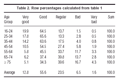
Each row divided by its row total is a vector called a profile, that is a set of proportions adding up to 1. In table 2 we have expressed the elements of each profile in the more familiar form of percentages which add up to 100%. It is the profiles which define the points in multidimensional space. The eventual map will attempt to show us these points representing the rows, or age groups in this case, where each age group is described by the vector of five coordinates, its distribution across the health status categories.
Each row profile point is then given a weight which is essentially a measure of importance of the point, called the mass. The row mass is the frequency of the row category divided by the grand total. For example, since age group 16-24 has 1223 respondents out of the total of 6371, then this row point is weighted by the mass 1223/6371 = 0.192. The row masses add up to 1, and are nothing else but the row marginal proportions of the table.
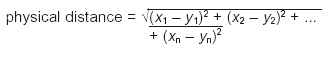
Finally we measure distance between row points by the c2 distance, which is a slight variant of the usual physical distance between points in vector space. Physical distance between two vectors x = [x1 x2 ... xn] and y = [y1 y2 ... yn] is measured as:
The c2 distance, however, is a distance which weights each squared term inversely by the corresponding column marginal proportion as follows:
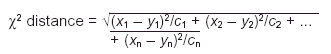
where in our example (see table 1) c1 = 817/6371 = 0,128, c2 = 3542/6371 = 0,556, and so on. The idea is to compensate for the different variances in the columns of the profile matrix. The range of values in the first column of table 2 will tend to be small, since the percentages are smaller (they vary from 5.1 to 19.9, that is 14.8 percentage points), whereas the range in the second column will be greater because overall they are larger percentages (they vary from 34.3 to 65.6, that is 31.3 percentage points). Dividing by the column margin effectively equalizes out these inherent differences in the column variances, and it can be argued that the chi-square distance is the natural Euclidean distance for frequency data.
The total variance in correspondence analysis is measured by the inertia, which is equal to the usual Pearson c2 statistic calculated on the crosstabulation, divided by the total sample size n. It is this inertia which measures the degree of difference between the age groups that we are trying to represent optimally in the eventual map.
As we have said, the map –usually two-dimensional– is obtained by weighted least-squares, and the row profile points are projected onto the map. The coordinates of these points are called principal coordinates, because they are the coordinates with respect to the principal axes of the space. Each principal axis accounts for a certain amount of the total inertia, called the principal inertia, usually expressed as a percentage of the total.
In addition we have points in the map representing the columns as well. There are different ways of representing the columns jointly with the rows, but the most common way is known as the symmetric map. In this map the column profiles have been analyzed in exactly the same way as we have just described, as if the matrix were transposed and the whole process repeated in a symmetric fashion, leading to the principal coordinates of the columns. The rows and columns are then jointly plotted with respect to the same axes, both in principal coordinates. The merits and demerits of this joint display are discussed in many texts3,6. Rather than enter into such a discussion, we prefer to illustrate how to interpret such maps correctly using actual examples.
Applications to crosstabulations
As a first illustration of how correspondence analysis operates, figure 1 shows the symmetric map of the age groups and health status categories of table 1.
What can we conclude from this map? First we look at the amounts of inertia and especially their percentages along each axis. Clearly, the first (horizontal) axis is very important, accounting for 97.3% of the inertia, and the second is of insignificant importance, accounting for only 1.5% of the total inertia. Thus the essential information in the original table is captured by the horizontal spread of the points.
The ordering of the health status categories along this dimension agrees with the implied order, from «very good» to «very bad», and their relative positions give scale values which can be interpreted: for example, there is little difference between «bad» and «very bad» but a very large difference between «good» and «regular».
The age groups can now be interpreted relative to the same dimension. We can thus see that there is only a small change from age group 16-24 to age group 25-34, then a larger step to age group 35-44, an even large step to age group 45-54, then the biggest step to age group 55-64, and then smaller steps to group 65-74 and group ³ 75.
The health scale values along the first axis (i.e., the principal coordinates) are centred and standardized in a particular way in CA but can be linearly transformed to any other scale to facilitate the interpretation. For example, we can transform these values by a translation and scale change to have endpoints equal to 0 and 100, with 0 representing «very bad» and 100 «very good»:
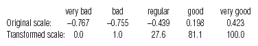
Notice that the category «regular» is not in the middle of the scale, but very much towards the lower end of the scale, at least in the perceptions of the respondents. Or, putting it another way, it is clearly a big step in a negative direction to admit one's health is «regular» as opposed to «good».
Using the above scale values one can establish a health status index and calculate average values for all respondents in each age group:
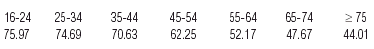
Figure 2 shows a conventional line plot of these values.
| Figure 2. Plot of health status index (first dimension of correspondence analysis) against age group. |
 |
Because of the high sample size in this survey, we can explore the data at least one level further by splitting the age groups according to another variable. «Sex» is the most obvious one, and table 3 shows the crosstabulation of the seven age groups split between males and females, tabulated again across the health categories.
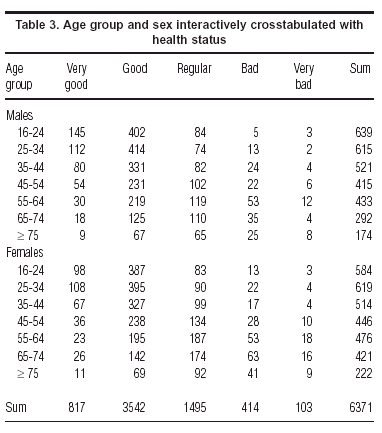
The symmetric map in figure 3 shows immediately that females consistently rate themselves as unhealthier than their male counterparts –the female points are always to the left of the male points of the corresponding age group, so that females of 65-74, for example, are rating their health worse than males > 75.
Tables 1 and 3 are contingency tables where the total of the table is in each case the sample size. The following example is of a question which has multiplle responses. The question is asked whether respondents have had to reduce their normal leisure time activities because of some pain or other symptom. For those that answer «yes», there follows a list of 18 possible symptoms, 17 specific ones and a category labelled «other». Since a respondent can indicate more than one ailment, the variable «ailment» is not a single categorical variable, but a set of 18 variables, one for each of the possible symptoms. There are various ways to handle such a situation. In table 4 we have tabulated the distributions of the five health status categories for each subset of respondents associated with the an ailment. Since these subsets can overlap (more than one ailment possibly mentioned by a single respondent), the table's total of 1369 is not the sample size but the number of ailments mentioned in total. This is a problematic case if one wants to test association between the rows and columns, but is still suitable for correspondence analysis which is just depicting this association visually.
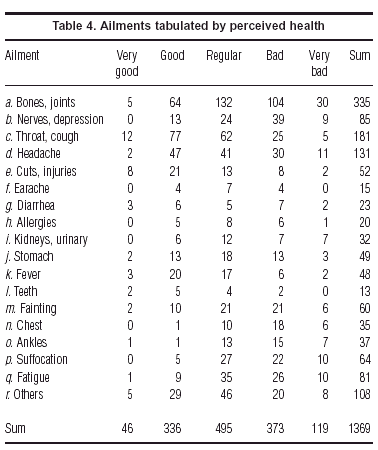
Figure 4 shows the symmetric map of this table. Again we find the five health status categories spread along the first principal axis with relative positions similar to those in the previous analyses. The ailments are thus scaled from left to right in accordance with the associated health status: «chest problems», «ankles», «breathing problems» and «nerves» on the «bad» left side, and «teeth», «injuries», «throat» and «fever» on the «good» right side. The second axis is more important here than in previous analyses, and is determined mostly by the status category «very good» and the three ailments in the upper part of the map: «diarrhea», «injuries» and «teeth». This indicates a subgroup of people who do report problems, but who also tend to report higher than average «very good» health, tending to have one of these afflictions which is just a temporary problem. Or, putting this another way, the ones with «very good» health are far from most of the ailments, and can be characterised only by accidental injuries and dental problems. Notice the position of «diarrhea», which is associated with a mixed group of people, ones who view their health at the «very good» end of the scale, and others at the opposite «very bad» end, and fewer than expected people with «regular» health.
Correspondence analysis as a scaling method
We have already seen an example in «Correspondance analysis» of what is called optimal scaling, where we obtained values for the health status categories which lead to maximum separation, or discrimination, of the age groups (or age-sex groups in the second example, or different ailments in the third example). In figure 4 we can consider the positions of ailments along the horizontal axis as reflecting their degree of perceived severity, with the more severe ailments on the left. In general, we can use CA to obtain optimal scale values for several categorical variables that are interrelated.
For example, a question in the health survey asks respondents which of 16 diff erent types of medecines they have taken during the previous two weeks (of the original 17 types, we excluded birth-control pills which only apply to women). More than half of the sample had not taken any medecines, so these respondents were excluded from this analysis. This situation differs from the previous ones, because we are not looking at the relation between the medecine consumption and another variable, such as age or perceived health status. Here we are trying to reduce the dimensionality of a set of variables in much the same way as in factor analysis, that is we are looking for common factors which capture the relationships between the different medecines. The objetive is identical to principal component analysis, apart from the fact that the variables are categorical in nature, and have no obvious quantifications, or scale values, assigned to the categories.
Multiple correspondence analysis –also known as homogeneity analysis8– is a variant of correspondence analysis which looks for optimal scale values for a set of categorical variables. To explain the optimality criterion inherent in multiple correspondence analysis, let us suppose that we made the ad hoc decision to assign the scale values 1 to each medecine taken and 0 to each medecine not taken, for each of the 16 medecines. Then each of the N respondents has a set of 16 scale values (which can be considered to form an N ´ 16 matrix), and we can calculate his or her overall score by adding up the scale values, giving an additional column consisting of the N scores. For this particular choice of scale values, the score is just the number of types of medecine taken. As in a reliability study, we can now calculate the correlation between the respondent score and each of the 16 scales, and measure how well the score reflects the 16 scales. This measure is typically the average of the squared correlations between the score vector and each of the 16 scales. Our 0/1 scale values are unlikely to maximize this criterion. Hence the objective of multiple correspondence analysis is to find out which scale values lead to a maximum value of this average squared correlation, so that in this sense the score explains the most variance in each of the 16 scales. Once this score «factor» has been identified we proceed to finding another set of scale values and associated score, uncorrelated with the score already identified, which again maximizes the average squared correlation, and so on.
In this case the data set is too large to report here, consisting of the numbers of respondents taking each particular combination of medecines. The basic numerical results of the analysis are given for the first three dimensions (i.e., factors) in table 5.
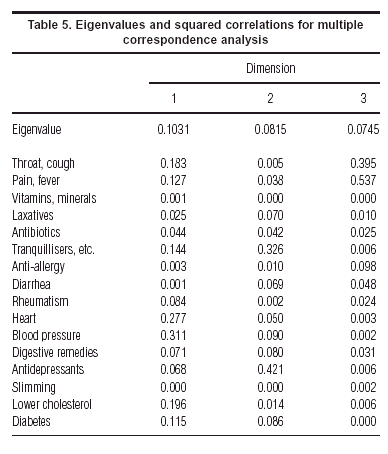
In this table the eigenvalues, or principal inertias, are the average squared correlations, for example 0.1031 is the average of the squared correlations for the first dimension. Another way of thinking about the results is that the entries are coefficients of determination (R2) giving the variance explained of each variable by each dimension (factor). Since the factors are uncorrelated, these R2 can be added up row-wise to give explained variances for two factors, or three factors, and so on. The dimensions are ordered in descending order of eigenvalue, the quantity which is optimized at each step of the analysis.
The optimal scale values for each medecine (not given here numerically) can be plotted, as before, in a map (fig. 5). This gives an interesting view of the interrelationships between the medecines, with the grouping at bottom right of the medecines for chronic diseases, at the top for psychiatric and digestive problems and on the left for the more common ailments of a transient nature.
| Figure 5. Multiple correspondence analysis, showing optimal scale values in two dimensions of «yes» responses to medecine types. |
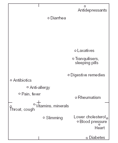 |
Using table 5 to identify the important points in the map, the first factor is a dimension which groups together the following medecines, in order of explained variance: medecines for blood pressure, for the heart, for lowering cholesterol and –to a lesser extent– for diabetes as well as tranquillisers and sleeping pills. It is interesting to note that medecines for minor ailments such as throat infection & flu, pains & fever, and antibiotics, are on the opposite side of this dimension. In other words, people who have been taking the former medecines for chronic health complaints are usually not taking these latter ones for less serious, transient, ailments.
The second factor groups mainly the following medecines: tranquillisers & sleeping pills, and antidepressants, in other words the «psychiatric» dimension. Although not so well-explained by this factor we also note high scale values for diarrhea and laxative medecines.
As an analysis complimentary to the mapping procedure, we can perform a hierarchical cluster analysis of the 16 types of medecine. Figure 6 shows the cluster tree, based on complete linkage and using the Jaccard index to measure similarity between the medecines. We can see the same clusters as in figure 5.
In the optimal scaling we can continue to interpret the factors beyond the second. For example, the third factor separates out the medecines for flu, throat, pains and fever, by themselves. These are the respondents who have had a bacterial or viral infection, and who are not taking any other medecine.
One issue which is fairly controversial in multiple correspondence analysis is the percentage of variance explained by each dimension. This problem has been thoroughly investigated by Greenacre3,4,9 and we give only the results here. If one calculates the percentages in the usual way, the multiple correspondence analysis would give percentages of 10.1, 8.1 and 7.5% for the first three dimensions, which seem quite pessimistic. However, by taking into account an adjustment which is fully explained in a practical context in Greenacre3, the percentages of inertia turn out to be 49.0, 10.7 and 5.0%, respectively. We can thus conclude that the two-dimensional map of figure 5 explains at least 59.7% of the total inertia in the 16 variables, and not 18.2% as calculated otherwise.
Exploring missing data
Correspondence analysis is frequently used to explore patterns of missing data in a survey, and to answer questions such as: is there a specific group of respondents tending to refuse to answer the same questions? Or, in other words, is non-response «correlated» between questions? A way to answer these questions would be to set up a data matrix of binary information, where for each respondent we simply code whether the respondent has replied or not, using a one for a missing response and a zero for an actual response, whatever that may be. We would code the data this way because we are interested more in the occurrence of a non-response than a response, but if we we wished to treat these two possibilities equally we would use the coding in multiple correspondence analysis and introduce two columns for each variable, a dummy variable for non-response and a dummy variable for response. Either way, the analysis of these matrices will give an idea of which questions have non-responses by the same people and also which respondents are associated with which non-responses.
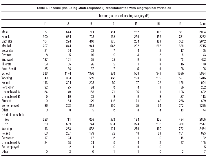
In this particular survey, the level of non-response is very low, so that such questions can not be investigated, but there is one variable –«Income»– which does have a large number of non-responses, in fact 1382, or almost 25% of the sample. Income, including a special additional category of non-response, was thus crosstabulated with the following biographical variables for which almost everyone gave complete responses: sex, marital status, level of schooling, personal work situation, and work situation of head of family (for respondents who are not family heads). Although these are separate crosstabulations, the fact that they have one question in common allows us to stack the tables one on top of each other (table 6). The correspondence analysis map of this set of tables will show as best as possible the relationship of each question with income, and we will be especially interested in the position of the income non-response category.
Figure 7 shows the resulting map. The income categories, labelled I1 to I6 in the map, lie in their expected order, from lowest income on the right to the highest income on the left. Notice that it is possible to change the sign of all the coordinates on the first axis so that higher income is on the right –this does not alter the analysis or substantive interpretation at all. It is interesting to see how the other categories are scaled from right to left in terms of their income profiles, from «illiterate», «pensioner» and «widowed» on the right to «head of household working», «working» and «student» on the left. The income non-response point (denoted by I? in the map) lies well on the higher income side, just below response I4 (150.000-200.000 ptas./month) with respect to the first axis. This is an estimate of the average position of this non-response group with respect to the other income groups. It is likely, however, that there is a wide spread of incomes within the non-response group, and more formal ways can be set up of estimating the income of individual respondents based on the biographical data.
Trend data
The usual way to display trends is in the form of a line plot with the horizontal axis depicting the time line and the vertical axis depicting the variable which is being observed over time. For example, a typical graph would be the number of cases of measles reported in Spain over the years 1989 to 1997, as given in figure 5.1.1 of Regidor & Gutiérrez-Fisac10. But in the table on which this figure is based (table 5.1.2 of this publication), the reported cases for each autonomous region in Spain are given for each year, 19 regions in all. To visualize and compare these trends would be difficult since we would have to make 19 different line plots and then try to compare them amongst one other and with the overall trend pattern. Correspondence analysis can be used to interpret the different trend lines.
The symmetric map of these data is given in figure 8. Without actually seeing the data we can obtain an understanding of the differences between the autonomous regions during this period. In this figure the centre of the display corresponds to the trend of the whole country, or average row profile. Thus a complete trend line is reduced to a point, and the points representing the autonomous regions will show how each region deviates from this overall pattern, with the year points facilitating the interpretation of these deviations.
The centre point also represents the average year pattern across the regions, and because the years have time order, we can connect them to show a trajectory which moves around the space. The trajectory traced out by the nine consecutive years is almost circular from 1989 to 1993. Then the years move towards the centre of the map (1994 to 1996), which is closer to the average pattern and then 1997 returns to a position near 1993 and 1994. The most outlying autonomous regions are those that show the greatest deviation from the average: Asturias in the initial years has more than average incidence, Cantabria in 1991, to Galicia, Aragón and then the group formed by Ceuta, La Rioja, Navarra and Melilla in 1992, and Canarias in 1993. Regions near the centre such as Baleares and Extremadura do not differ as much from the average trend.
Conclusions
We have tried to give an overview of how correspondence analysis can assist in deciphering the complex information contained in a national health survey. From a simple cross-tabulation to a multiway table and a set of intercorrelated categorical variables, correspondence analysis provides a medium for exposing patterns in the data and suggesting hypotheses. It also facilitates the quantification of categorical data, which can assist with the model-building process. Optimal scales can be defined which capture a maximum percentage of variation and condense the data at the same time, and these scales can be used in other analyses which require interval scales. The method also allows investigation of missing data, which can be considered as an additional categorical response. In the visualization of trend data, the points corresponding to successive time points are linked to show the pattern in the changing profiles over time.
Acknowledgements
This work appeared originally in an extended form as a report commissioned by the Fundación Banco Bilbao-Vizcaya-Argentaria. We wish to thank Profs. Guillem López, Jaume Puig and Ángel López for their assistance and comments on the manuscript.
Bibliografía
1. Benzécri JP. Analyse des données. Tome I: Analyse des correspondances. Tome II: La Classification. Paris: Dunod, 1973. [ Links ]
2. Greenacre MJ. Theory and applications of correspondence analysis. London: Academic Press, 1984. [ Links ]
3. Blasius J, Greenacre MJ. Visualization of categorical data. San Diego: Academic Press, 1998. [ Links ]
4. Greenacre MJ. Correspondence analysis in practice. London: Academic Press, 1993. [ Links ]
5. Greenacre MJ, Blasius J. Correspondence analysis in the social sciences. London: Academic Press, 1994. [ Links ]
6. Lebart L, Morineau A, Warwick K. Multivariate descriptive statistical analysis. Chichester, UK: Wiley, 1984. [ Links ]
7. Greenacre MJ. Correspondence analysis in medical research. Statistical Methods in Medical Research, 1992;1:97-117. [ Links ]
8. Gifi A. Nonlinear multivariate analysis. Chichester, UK: Wiley, 1990. [ Links ]
9. Greenacre MJ. Correspondence analysis of multivariate categorical data by weighted least squares. Biometrika, 1988;75:457-67. [ Links ]
10. Regidor E, Gutiérrez-Fizac JL. Indicadores de salud. Cuarta evaluación en España del Programa Regional Europeo Salud para Todos. Madrid: Ministerio de Sanidad y Consumo, 1999. [ Links ]

